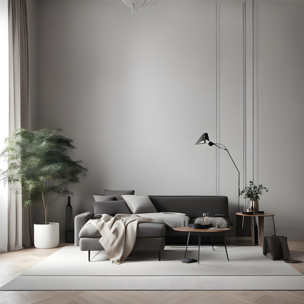
Understanding the fundamental ideas is the first step for those who want to apply minimalism design principles. It’s critical to put use over ornamentation and concentrate on the key components that fulfill a goal.
An additional essential component of minimalism is the use of negative space. In order to achieve harmony and balance in their compositions, designers sometimes leave specific regions unfilled on purpose. The intended focal points are brought to the viewer’s attention and allowed to rest thanks to negative space.
Minimalism – Stripping Away the Unnecessary
Eliminating extraneous details and distilling designs to their essential aspects are the cornerstones of minimalism. This idea can be applied to our lives and mindsets in addition to visual design. Our mental and physical spaces can feel more clear, focused, and liberating when we simplify.
In minimalism, it really is more about less. Every component should have a role and enhance the design’s overall usability. With this deliberate approach, designers may give their users experiences that are both aesthetically pleasing and carefully selected.
Utilizing Negative Space in Minimalism
Whitespace, or negative space, is a key component of minimalism. In their compositions, minimalist can achieve harmony and balance by embracing the voids that exist between items.
Effective use of negative space can highlight a design’s essential components, making them stand out and better convey the intended message. A skillful use of negative space gives minimalist designs a touch of refinement and grace.
Finding Balance in Minimalism

While simplicity is the hallmark of minimalism, striking the correct balance is essential. Even while it could be tempting to take out as much as possible, it’s important to make sure the design still serves the intended function and communicates the intended message.
Achieving balance requires giving considerable thought to color, composition, and the interactions between various parts. In order to provide visual interest without detracting from the minimalist aesthetic, designers must create a harmonic balance between negative space and the fundamental elements.
Minimalist Design – A Reflection of the Times
One could see minimalism as a reflection of the cultural and technical environment we live in today. A visual retreat from the turmoil offered by minimalist design is particularly useful as our lives become increasingly intricate and linked.
In addition, the yearning for genuineness and significant experiences is echoed by minimalism. A greater sense of connection and engagement is fostered by minimalist design, which eliminates pointless distractions and enables consumers to concentrate on what really matters.
Crafting a Minimalist Aesthetic for Your Brand
If you want to incorporate a minimalist style, there are a few important things to think about. Establish your core principles and messaging first, making sure they complement the practicality and simplicity of minimalism.
Select a muted color scheme that embodies the character of your home and evokes the feelings you want. Additionally, typography ought to be clear and readable in order to blend in with the overall minimalist look. Maintaining uniformity throughout all interfaces will strengthen the minimalist character of your home.
In conclusion, because of its many advantages, social influence, and timeless appeal, minimalism is still in vogue. Minimalism emphasizes utility, minimalism, and negative space to produce aesthetically beautiful and user-focused experiences. There is no doubting the timeless power of minimalism, whether you’re looking for inspiration or to hone your aesthetic.
Also read: Why minimalist design is trending?
